Dark/Light theme with TailwindCSS and Nuxt

Dark and light mode support has been a recent trend due to the impact on our eye sights caused by the time spent on devices. With TailwindCSS and the proper Nuxt.js (Nuxt) modules, we can easily enable this feature, with the ability to customize each mode's look-and-feel to your taste.
Ready? Go.
TL;DR 🤷🏻♀️
In short, you follow the simple steps below to enable dark/light mode with TailwindCSS and Nuxt color mode module:
- Install a Nuxt project using
yarn create nuxt-app <project-name>and choose TailwindCSS as a UI framework from the configuration selection. In case of an existing Nuxt project, runyarn add --dev @nuxtjs/tailwindcssand add the module@nuxtjs/tailwindcssto the list ofbuildModulesinnuxt.config.js - Install
tailwindcss-dark-modeand@nuxtjs/color-mode - Declare the use of
tailwindcss-dark-modeas a plugin in the collection ofpluginsintailwind.config.js. Similarly with@nuxtjs/color-modeby addingrequire('tailwindcss-dark-mode')()to the collection ofpluginsinnuxt.config.js - Declare the use of dark mode variants per CSS utilities in
variantsfield intailwind.config.js - Map the
.dark-modeselector created by Nuxt color mode module as value totheme.darkSelectorkey intailwind.config.js - Add
dark-modetopurgeCSS.whitelistinnuxt.config.js - Start assigning dark mode styles for elements using generated classes with syntax
${dark-mode-variant}:${normal-generated-class-for-css-property}
Too short to understand? Let's go through slowly, shall we? 😉
What is Nuxt.js?
Nuxt.js - or Nuxt for short - is a server-side rendering (SSR) framework based on Vue.js, and it offers developers:
- The flexibility - with a single codebase, developers have three build options to output their application, such as universal (pure SSR), single page application (SPA), and static sites.
- Organized code structure - a Nuxt app template comes with logical folder structures with a built-in router mechanism.
- Performance optimization - auto code-splitting per page, keeping JavaScript bundled size relatively small for faster delivery.
Also, Nuxt is surrounded by a well-maintained ecosystem - the Nuxt community, which provides lots of practical modules, plugins, and support to simplify the development process.
What is TailwindCSS?
TailwindCSS is a very efficient utility-first CSS framework. It offers developers a set of ready classes for different CSS utility properties such as margin, padding, font-size for styling. For example, to make the below button:

It’s enough to apply the available classes accordingly:
<button
    class="py-2 px-3 bg-green-500 rounded shadow-md text-white uppercase"
>
 Button
</button>
In which:
py-- prefix for styles applied topadding-topandpadding-bottom, similarly withpx-for settingpadding-leftandpadding-rightpropertiesbg-- prefer forbackground, followed by a color palette.rounded- set the value ofborder-radiusshadow-- prefix forbox-shadowtext-- prefix for any text related CSS properties (font-sizeandcolor), liketext-whitefor setting thecolorto white.uppercase- for setting the value oftext-transformtouppercase
We can also combine different classes to create custom class, such as the btn class from the classes used in the example aboveThe significant advantage of TailwindCSS is that it allows developers to write less CSS code (and less repetitive) for utilities and, hence, keep the overall design consistent, with @apply
.btn {
    @apply py-2 px-3 bg-green-500 rounded-md shadow-md text-white uppercase;
}
TailwindCSS will generate the related styles into a single rule set for .btn class selector, as seen in browser:

The significant advantage of TailwindCSS is that it allows developers to write less CSS code (and less repetitive) for utilities and, hence, keep the overall design consistent. Besides, by using PurgeCSS in the back, TailwindCSS offers the ability to remove unused classes in our application and thus optimize the size of CSS needed on production.
Got the idea of Nuxt and TailwindCSS? Great. How do we start?
Setting up a Nuxt project with TailwindCSS
The most straightforward way to initialize a new Nuxt project is to use create-nuxt-app scaffolding tool made by the official Nuxt team. To install create-nuxt-app, we use the following command:
npm i create-nuxt-app
⚠️ If you have create-nuxt-app installed previously lower than 3.1.0, make sure to rerun this command and update it to the latest version.
Once we have create-nuxt-app installed, let's create an empty Nuxt project using one of the following methods:
#Using npm (v6.1 onwards)
npm init nuxt-app <your-project-name>

#Or using YARN
yarn create nuxt-app <your-project-name>

#Or using npx
npx create-nuxt-app <your-project-name>
And then select configuration for our app accordingly.
To add TailwindCSS, we simply choose Tailwind CSS from a selection list of UI framework, as seen below:

And that's it. We have TailwindCSS added to our newly-created application and ready to use 🎉.
❗For adding TailwindCSS to existing Nuxt project, we install the Nuxt module @nuxtjs/tailwindcss
yarn add --dev @nuxtjs/tailwindcss

# or
npm i --save-dev @nuxtjs/tailwindcss
Then add @nuxtjs/tailwindcss as a module to buildModules (or modules for Nuxt version < 2.9.0) in the nuxt.config.js file:
export default {
    //...
    buildModules: [
        '@nuxtjs/tailwindcss'
    ]
}
Simple as that.
Now let's navigate to our project directory and start theming.
Theme your project with TailwindCSS
The Nuxt module for TailwindCSS will automatically add two files to your project directory:
~/assets/css/tailwind.css- which includes all the basic Tailwind styles likebasics,components, andutilitiesfor use in our application.~/tailwind.config.js- the configuration file for additional customization, as shown below:
// tailwind.config.js
module.exports = {
  theme: {},
  variants: {},
  plugins: [],
    purge: []
}
Let’s look a bit into the properties defined in this file:
theme- where we set up all the projects' additional customized theming, including color palette, font family, breakpoints, border, minimum/maximum sizes, etc.variant- where we define an array of responsive and pseudo-class variant for selected core utility plugins such asappearance,borderColor,outlineorzIndex, etc.plugins- a collection of JavaScript functions that allow us to register additional styles programmatically.purge- can be an Array, an Object, or a Boolean value indicating how we want to remove unused styles (or not). The Nuxt module for TailwindCSS automatically adds the needed code to enable purging CSS code during production, following with a list of files that have reference to any used CSS styles by name.
purge: {
    //enable remove unused CSS only in production
    enabled: process.env.NODE_ENV === 'production',
    //any file that may contain the reference of CSS styles by class name.
  content: [
    'components/**/*.vue',
    'layouts/**/*.vue',
    'pages/**/*.vue',
    'plugins/**/*.js',
    'nuxt.config.js'
  ]
}
We now use tailwind.config.js to configure the custom look and feel for our application.
Configure your custom color theme in tailwind.config.js
Assume we have the following color palettes we would like to use as the main theme in our application:

To override the default theme given by TailwindCSS, we can modify the theme object with the colors field directly.
/* override the default colors */
module.exports = {
    theme: {
        colors: {}
    },
}
However, in case we would like to keep the default theme, TailwindCSS provides us the option to add extra theme by using theme.extend key, which receives an Object of theming options as value, same as theme.
/* without override the default colors */
module.exports = {
    theme: {
        extend: {
            colors: {}
        }
    },
}
Personally I recommend to use extend to enjoy both benefit of the main custom theme colors and the default set of colors for other minor uses.
Let's define our above set of color palettes as properties under colors field of theme.extend, as shown below:
module.exports = {
    theme: {
        extend: {
            colors: {
        green: '#59981A',
        'green-yellow': '#ECF87F',
        'green-lime': '#81B622',
        'green-olive': '#3D550C',
      },
        },
    },
}
💡Tip: You can even group palettes into a nested object under colors and define them as modifiers, keeping your code organized:
module.exports = {
    theme: {
        extend: {
            colors: {
        green: {
                    default: '#59981A',
                    yellow: '#ECF87F',
            lime: '#81B622',
            olive: '#3D550C',
      },
        },
    },
}
That's all we need to do. Now our color palettes are ready to use.
Use TailwindCSS in your Nuxt project
All the added color palettes are available under generated classes with the following syntax:
${prefix-for-css-property}-${color-key}-${modifier}
The prefix is the variant that stands for a CSS property relatively. In this case, TailwindCSS only generates the new classes for CSS properties, which accepts color as its value, such as background, color, border, etc. An example of newly generated classes from the above color palette are:

To apply our green palette to the background color of the whole app, add bg-green as a class of the main div of the default layout:
<!-- ~/layouts/default.vue -->
<template>
  <div class="bg-green">
    <Nuxt />
  </div>
</template>
Our main page will change from the default background color:

to the selected green color:

Simple right? And we can continue building our app's custom look and feel with these custom generated classes.
Now let's continue to our next topic - how do we enable different color themes for dark/light mode with TailwindCSS?
Dark/ Light mode with @nuxtjs/color-mode module
Now that we have our green color palette ready for use, our next goal is to map green.olive to dark mode as its theme, and green.yellow for light mode, according the below design:

To achieve our goal, we will need to set up two additional plugins:
@nuxtjs/color-mode- a Nuxt plugin for toggling between dark/light mode for the site and auto-detecting the right mode from the device's system appearance,tailwindcss-dark-mode- a TailwindCSS plugin for injecting and enabling dark mode variants.
Add the color mode module
We first install the Nuxt module @nuxtjs/color-mode by running one of the following commands
yarn add --dev @nuxtjs/color-mode

#OR
npm i --save-dev @nuxtjs/color-mode
Then configure our app to use it as a module of buildModules in nuxt.config.js
/* ~/nuxt.config.js */
module.exports = {
  buildModules: [ '@nuxtjs/color-mode' ]
}
Once installed, the color mode module will add to the root element <html> a class with the syntax .${colorMode}-mode. The value of colorMode can be dark, light, and system. Also, it exposes to all Nuxt components within the application a helper object $colorMode, containing the following fields:
preference- the actual preferred (selected) color mode by the uservalue- read-only, indicating the detected color mode from the device's system appearanceunknown- read-only, indicating whether we need to render a placeholder.
We can set basic color theme (background and text color) for our entire app in response to dark/light mode using the generated class dark-mode and light-mode , as below:
/* ~/layouts/default.vue */
<style>
    .dark-mode {
        @apply text-white bg-green-olive;
    }

    .light-mode {
        @apply text-black bg-green-yellow;
    }
</style>
Since our theme is set up, we need a way to toggle between these two modes. So let's make a button!
Make a toggle button for dark/light mode
To switch between dark/light mode, we create a button whose labels will toggle between Dark and Light. Add a new file ColorMode.vue as a Vue component to components folder and add the following code to the <template> section:
<!-- ~/components/ColorMode.vue -->
<button class="btn border border-white capitalize" @click="changeMode">
    {{ btnLabel }}
</button>
with btnLabel is set as a computed variable:
/* ~/component/ColorMode.vue */
export default {
    computed: {
        btnLabel() {
            return this.$colorMode.preference === 'light' ? 'dark' : 'light'
        }
    }
}
We also define the logic for changeMode method, which will change the current selected color mode preference of $colorMode to dark if the current view is light and vice versa.
/* ~/component/ColorMode.vue */
export default {
    methods: {
        changeMode() {
            this.$colorMode.preference =
                this.$colorMode.preference === 'light' ? 'dark' : 'light'
        }
    }
}
The result will be:
Now the button works as we expect.
There is one problem - what's if we want to change the theme on an element explicitly on a state (hover) for dark/light mode? Or to assign different colors to buttons? It will require writing lots of CSS rule sets to accomplish these base on the explicit such as two different sets of CSS styles for new selectors .dark-mode button:hover and light-mode button:hover and so on. Thus we end up with more heavy CSS code that won't cover 100% use cases, and it's against our initial idea to use TailwindCSS.
So what can TailwindCSS offer us to address these challenges? Let's check out the next plugin - tailwindcss-dark-mode.
Toggle dark/light mode with TailwindCSS classes
tailwindcss-dark-mode plugin enables the variants for dark mode so that TailwindCSS can generate the classes ready for use. To add the plugin to our app, run one of the following commands:
yarn add --dev tailwindcss-dark-mode

# or
npm i --save-dev tailwindcss-dark-mode
Then we set it for use in plugins as a TailwindCSS plugin in tailwind.config.js
/* ~/tailwind.config.js */
module.exports = {
    //...
    plugins: [require('tailwindcss-dark-mode')()]
}
This plugin injects all available dark mode variants to our app, such as
dark,dark-hover(on hover),dark-group-hover(hovering on a group of elements),dark-focus(when focus on an element),dark-focus-within(when any of its child element got focused on),dark-active(when an element is on active mode),dark-even(fornth-child(even)- elements whose index is event),dark-odd(for those whose index is odd).
However, it is not enough to start using. We need to declare these variants with the core utilities we want to apply to them. Based on that, TailwindCSS will map them and the related utilities to generated the new classes accordingly. To do so, we define the needed variants with the desired CSS utilities inside the variants field of tailwind.config.js, as shown below:
/* ~/tailwind.config.js */
module.exports = {
    //...
    variants: {
        backgroundColor: [
      'dark',
      'dark-hover',
      'dark-group-hover',
      'dark-even',
      'dark-odd',
      'hover',
      'responsive'
    ],
    borderColor: [
      'dark',
      'dark-focus',
      'dark-focus-within',
      'hover',
      'responsive'
    ],
    textColor: ['dark', 'dark-hover', 'dark-active', 'hover', 'responsive']
    }
}
TailwindCSS will generate the additional classes for dark mode according to the following syntax:
${dark-mode-variant}:${normal-generated-class-for-css-property}
Some examples are dark:bg-green-yellow to apply green-yellow color variant to background-color, dark-hover:bg-green to apply green color on the background when the element is on hover.
And lastly, we need to inform TailwindCSS that our .dark-mode class selector is the main selector for dark mode by mapping it to darkSelector field of theme in tailwind.config.js
module.exports = {
    theme: {
        darkSelector: '.dark-mode',
    }
}
Behind the scenes, TailwindCSS will auto-generate the CSS rule set for dark mode according to the assigned selector - .dark-mode .
An example for setting border-color of button to white color on dark mode is as below:
<button
  class="btn border capitalize border-black dark:border-white"
  @click="changeMode"
>
    Button
</button>
The generated css style on the client-side will be something similar to:
.dark-mode .dark\:border-white {
    border-color: #fff;
}
This approach ensures the explicit of dark mode selectors over other TailwindCSS selectors.
And that's all it takes. We can now indicate the style for dark mode for any CSS utilities with the dark mode variants included in variants, by following the class syntax mentioned above.
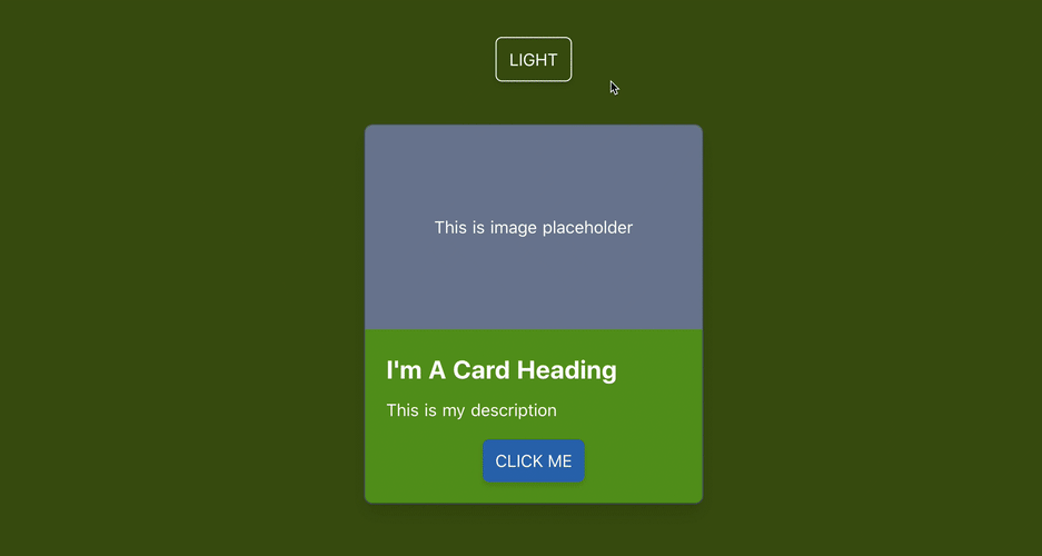
For example, if we want to make a simple card follows the below design:

We first define the card template:
<div class="card">
    <div class="card-placeholder">
      This is image placeholder
    </div>
    <div class="p-5 text-left rounded-b-lg">
      <h2 class="text-2xl font-bold capitalize">I'm a card heading</h2>
      <p class="py-2">This is my description</p>
      <button class="card-btn">
        Click me
      </button>
    </div>
  </div>
With the base styles which are consistent in both modes
.card {
  @apply m-5 border shadow-lg rounded-lg w-1/2;
}

.card-placeholder {
  @apply flex h-48 items-center justify-center rounded-t-lg;
}

.card-btn {
  @apply mt-2 mx-auto block py-2 px-3 rounded-md shadow-md uppercase;
}
Let's add some required styling for light mode (as our default mode), such as:
border-whiteandbg-green-limeto the card wrapperdiv.cardbg-gray-300to the image placeholderdiv.placeholderbg-blue-300andhover:bg-blue-500for hover state to the card's main buttonbutton.card-btn
And the corresponding classes for dark mode, starting with dark: :
dark:border-gray-700anddark:bg-greentodiv.carddark:bg-gray-600todiv.placeholderdark:bg-blue-700and hover statedark-hover:bg-blue-300tobutton.card-btn
The result is:
🎉 We can apply the same approach to style our entire app at the minimum effort needed for theming. Less code to write, isn't that awesome? 😉
⚠️⚠️ Important note: The class dark-mode is assigned programmatically on run-time and does not appear manually as class value for any component in our code. Hence PurgeCSS will remove all the generated stylings and classes related to it on bundling, as it understood wrongly that this is an unused CSS selector. To prevent this specific behavior, we need to add dark-mode to the list of whitelist selectors for purgeCSS we'd like PurgeCSS to include in nuxt.config.js.
/* ~/nuxt.config.js */
module.exports = {
    purgeCSS: {
        whitelist: ['dark-mode']
    }
}
So far, so good?
Next, we are going to how we can structure our theming configuration in a reusable and organized way.
Be organized with CSS Variables
Exactly. Up to this point, our extended theme color palettes for our demo app are organized as below:
/* ~/tailwind.config.js */
module.exports = {
    theme: {
        extend: {
            colors: {
        green: {
                    default: '#59981A',
                    yellow: '#ECF87F',
            lime: '#81B622',
            olive: '#3D550C',
      },
        },
    },
}
It's totally fine to leave as it is. Nevertheless, these HEX color values are hard-coded and known only within tailwind.config.js. If we need to access these colors in a separate <style> section, it is impossible without copy/paste the value. A good example is if we want to create an app background with gradients. Repeating the hard-coded color value complicates our code and make it harder to do approriate adjustment to the colors in the future, especially when we want to change the color palettes.
That's why CSS Variables are useful.
Instead of manually typing the color values to tailwind.config.js, we add a new CSS file called palettes.css located in ~/assets/css/ directory and declare the color palettes as CSS variables to the :root element of the app.
/* ~/assets/css/palettes.css */
:root {
  --green-default: #59981A;
  --green-yellow: #ECF87F;
  --green-lime: #81B622;
  --green-olive: #3D550C;
}
Import this file in ~/assets/css/tailwind.css
/* ~/assets/css/tailwind.css */
@import './palettes.css'; /* Our custom palettes */

@import 'tailwindcss/base';
@import 'tailwindcss/components';
@import 'tailwindcss/utilities';
Then replace all the hard coded color values in tailwind.config.js to the values of defined CSS variables accordingly:
/* ~/tailwind.config.js */
module.exports = {
  theme: {
    extend: {
      colors: {
        green: {
          default: 'var(--green-default)',
          yellow: 'var(--green-yellow)',
          lime: 'var(--green-lime)',
          olive: 'var(--green-olive)',
        },
      },
    },
    },
}
We separate the configuration for TailwindCSS from our color palettes, and those CSS variables are accessible throughout the app. When there is a need to change for color, we only need to make the appropriate change to this palettes.css file, limiting the bug's chance 🐛 and keeping the code reusable.
Demo
The demo code is available for trying. 👇

You can also check out my portfolio site's repo for more TailwindCSS and Nuxt use cases. 🙂
Summary
I enjoyed developing my portfolio site with Nuxt and TailwindCSS. Writing and maintaining CSS code has never been easy, especially with repetitive utility-style (like padding, margin, etc.) and tracking down unused CSS code to remove. But TailwindCSS helps to solve these two problems smartly.
Dark/light mode may not be a written requirement for accessibility enhancement, but it is a huge benefit for users. Light sensitivity becomes more common nowadays, and more large companies like Apple and Google provide dark/light mode by default. So if enabling dark/light mode brings comfort to our users, and is easy to implement with TailwindCSS and Nuxt color mode, why not apply it? 😉
If you haven't known Nuxt or TailwindCSS before, I suggest giving them a try and experiment with their awesomeness and power they can bring to your web development process. And if you built something with Nuxt and TailwindCSS, share it with me 🔥.
👉 If you'd like to catch up with me sometimes, follow me on Twitter | Facebook.
Like this post or find it useful? Hit the share button 👇🏼 😉
Learning Vue
Learn the core concepts of Vue.js, the modern JavaScript framework for building frontend applications and interfaces from scratch