Focus or focus visible? A guide to make your focus state accessible
App navigation is crucial for users regardless of what device they are using. A straightforward example is navigating and interacting with a website's content when your mouse runs out of battery. With focus indicator and keyboard navigation support, it will be easier to understand where you are within a website or perform any desired action to any interactive elements. In this post, we will explore different CSS supports for the focus state and how to use them to make your focus state accessible and pretty.
But first, let's understand what interactive HTML elements are and how they behave.
Table of Content
- Table of Content
- Interactive HTML elements
- Understanding focus pseudo-classes
- The scenarios for focus-visible
- Summary
Interactive HTML elements
Interactive elements will execute some actions upon the user's interaction, such as input, select, checkbox, buttons, and links. Each interactive piece behaves differently but generally changes its state upon the user's interaction. And you can navigate to interactive elements with a keyboard by hitting the Tab key unless its tabindex attribute is set to -1.
Below is how a clear focus indicator can help a user know his location and navigate his way within a page using a keyboard only.

And to help bring better visual accessibility to users on navigation, particularly on focus state, CSS offers us several focus pseudo-classes. Among them are :focus and :focus-visible, which we will explore next.
Understanding focus pseudo-classes
By default, the browser provides an outline when an element is in focus mode triggered by the user's interactions. However, often we want to override this default styling or add additional styles and provide a better UX for the users. In such cases, we can use the following CSS pseudo-classes: focus and focus-visible.
Let's explore the difference between them and when to use them.
Using :focus
:focus is the CSS pseudo-class that indicates whether an interactive element is in focus mode. Focus mode happens when a user clicks a tab to select or change the element's value (such as input fields) or navigates to it using the keyboard's Tab key.
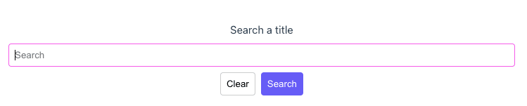
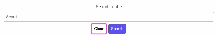
We will look at the following example of a search box containing an input field and two buttons:
<label>Search a title</label>
<input type="text" placeholder="Search" id="search-box" />
<div>
    <button class="clear-btn">Clear</button>
    <button class="search-btn">Search</button>
</div>
And we add CSS stylings on the :focus class of the input and the two buttons:
#searchbox:focus {
    outline: none;
    border-color: #665cf6;
}

.clear-btn:focus {
    outline: 2px solid #665cf6;
}

.search-btn:focus {
    outline: 2px solid #453ead;
}
Upon the user focusing on one of these elements by using the Tab key or by clicking on the elements themselves, there will be outline or border styling applied to these elements accordingly, as seen below:

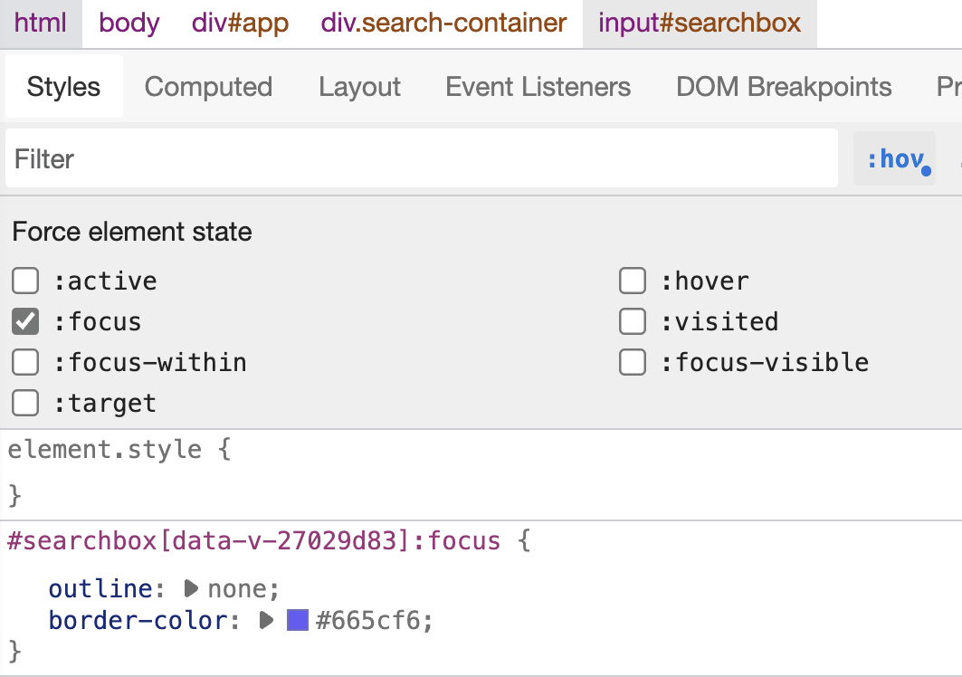
To debug and test your CSS style for :focus without actual interaction, in your browser Inspect panel, you can inspect the target element, select Toggle Element State, and check the option :focus. The browser will then display the part as being focused and show the relevant CSS styles, as in the following screenshot:
That's it for :focus. Next, we will explore focus:visible and how it differs from :focus.
Using :focus-visible
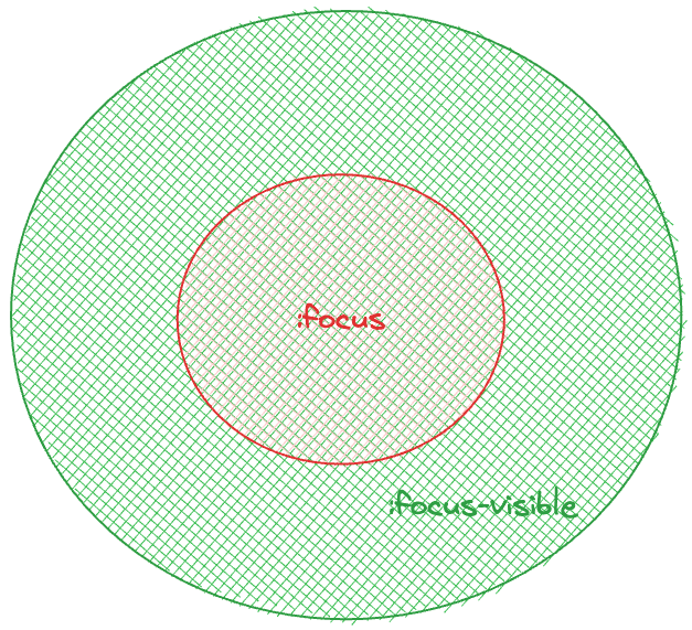
While :focus is the general pseudo-class that denotes an element on focus, :focus-visible only represents interactive elements that satisfy the two following conditions:
- Elements are in focus (matched the condition of
:focus) - There is a need for a visible focus indicator on these elements.
To understand it better, let's look at our previous example of the search box and add the following styles to #searchbox:focus-visible right after #searchbox:focus:
/*...*/
#searchbox:focus-visible {
    outline: none;
    border-color: #f65ce9;
}
When the input is focused, its border color will change to #f65ce9.
And if you switch the appearing order of #searchbox:focus-visible stylings and #searchbox:focus, its border will have the color of #searchbox:focus instead. We can explain that since the input field always needs a visible focus indicator for the user to focus (clicking the element to start typing), our input satisfies both conditions for focus-visible (and indeed, for focus), hence the applied styles.
But is it the same for buttons and links? Let's perform a similar check by adding the following styles to .clear-btn:focus-visible after .clear-btn:focus:
.clear-btn:focus-visible {
    box-shadow: 0 0 0 3px #f65ce9;
    outline: none;
}
Upon focusing on this clear-btn using the Tab key, we will see the style of the button change to have the box-shadow and without any outline. However, if we click on the button with a mouse device, the styles are back to the previous outline indicated in .clear-btn:focus.
If we revert the order of .clear-btn:focus-visible to be before .clear-btn:focus, the .clear-btn will have the outline in .clear-btn:focus, and box-shadow from .clear-btn:focus-visible. And on the user's mouse click, there would be only the outline style applied, as seen below:

So, why is there a difference in the browser's styling behaviors between a focus done with a mouse click and one with a keyboard or between buttons (links) and inputs?
Because of how the browsers (or user agents) determine if an interactive element needs a focus indicator (see the specifications). For our scenario, because input support user input, the focus indicator should be visible in any circumstance for the user to know where they are typing. Buttons or links on the other hand, does not. Unless the user interacts with a Tab key. In this case, to know which element they land on, interaction using a pointing device like a mouse or touch will only match the first condition of being in focus mode.
focus-visible is very handy when you want to style an element differently explicitly for keyboard navigation support. A good example is a link element that changes color on regular focus and always has an excellent outline only when the user lands on it using the Tab key for better accessibility, as seen below:

Great. Here comes the next question - in which circumstance the browser will apply :focus-visible to an element? Let's find out.
The scenarios for focus-visible
In general, there are four main scenarios that the browser may apply :focus-visible:
- Element that supports user input using the keyboard (virtual or physical) like
input. - Navigating to the element using a keyboard.
- Using
:hovto toggle the focus state in the Element Inspector (see screenshot below) or explicitly setting the focus to be visible in the browser's settings. - Programmatically moving focus from a
focus:visibleelement to another.
And that's it. You are now ready to focus your elements with styles in an accessible manner!
Summary
In this post, we have learned about the :focus pseudo-class and how it differs from :focus-visible. We have also learned about the scenarios the browser that may apply :focus-visible to an element and how we can use it to style our elements in an accessible manner. In the next post, we will explore further using other focus CSS pseudo-class, such as :focus-within, and how to use them to create a better user experience and accessibility.
👉 Learn about Vue with my new book Learning Vue. The early release is available now!
👉 If you'd like to catch up with me sometimes, follow me on Twitter | Facebook | Threads.
👉 Want to support me? Buy me a coffee.
Like this post or find it helpful? Share it 👇🏼 😉